Welcome to Mast
Mast is a lightweight, component-first framework for Webflow. It uses tried and true front-end development methodologies from inside and outside of the Webflow community to enable you to build in an efficient, scalable and reusable way.
Read Docs ↓Why mast ↗See what's new in Mast v2.0
Buckle up for a lightning overview of what changed in v2.0!

Getting Started
Getting started with Mast is as easy as cloning the style guide and adjusting it to suit your projects brand. For a more in-depth look at the key concepts and details to know when building your first project in Mast, check out the video below:
Style Guidecopy link
How to start a new projectcopy link
- Clone the Mast style guide project
Update Project Settings
- General tab > name and subdomain
- Fonts > add any necessary custom fonts
Go to the Customize section below to learn how to update the variables and classes that align with the brand specs of your project.
How to add to an existing projectcopy link
- Clone the Mast style guide project
- Open the cloned style guide project in one tab, and your existing project in another.
- Create a new style guide page in your existing project.
Copy and paste all elements from the Mast style guide project into your existing project, in the order below. Following the correct order is important to ensure Webflow creates the class in the proper cascade.
Note: When pasting elements into the existing project, if there happens to be duplicate classes you will see a notification in the top right corner. If you see this, undo the paste, then update the class names of any existing classes that were stated in the notification so their have a prefix of old_. This way, pasted Mast classes will take priority and not be renamed.
Note: Mast v1.2 introduced Variables. Unfortunately they are not yet supported in this existing project copy/paste workflow.
Style guide nav
- Once all sections below have been pasted, come back to the nav to update the anchor links appropriately.
Layout Section
- We do this one second so all other following sections can use the layout grid system as expected.
Typography Section
- You will need to update the element level headings to match the Mast class level headings.
- Also check the element level styling of the paragraph, unordered list, and ordered list to ensure they align with your preference or the Mast base styles.
- Color Section
- Components Section
- Utilities Section
Customizing Mastcopy link
Update Variables
This first step to customizing Mast for your project is to open up the variables panel in Webflow, and go through each collection to update the type, colors, layout, and component variables to match your project's design system. Below is a bit more details to consider when going updating each variable collection:
Color
We recommend only adding brand colors that you know will be used in the project. For example, if the brand guidelines has 12 colors, but only 6 are used throughout the site, just add those 6 and any others can be added later as they are also added to some part of the UI.
Theme
After base colors are set, head over to the theme collection and update the background and text color values in the base mode to define how the default theme of the site should look (ie light or dark mode). Then, if the project will likely also utilize and inverted color mode for pages, sections, or components, you can update or remove Invert mode as well. Similarly, the Accent 1 and Accent 2 modes are there by default to use as needed, but if your project doesn't need them we recommend deleting them.
Other collections
The other collections are fairly straight forward and can be updated as needed to align with your project's brand, while removing or adding any other variables as needed. See the Variables section below for more information on the setup and strategy behind variables in Mast.
Update Classes link
Once all variables have been updated, now its time to go through the styles and components pages section by section to refine any additional styling on base classes further.
Styles page
On this page, you just need to update the fonts grid at the top, and colors section in the middle to document those corresponding aspects of the project's design system.
Components page
On this page, you will need to go through each section to review and update the styling of each core component as it should align with the project's brand.
Designing for Mastcopy link
Mast has been iterated for years to work with virtually any brand. From its versatile grid system, to the core fundamentals that still encourage custom classes when needed, you can be confident to build anything with Mast.
The Mast Style Guide for Figma
Setup your project styles for typography, colors, buttons, and forms directly in Figma.
Get FigMa File ↗.webp)
Using the Figma Style Guidecopy link
The Mast Style Guide for Figma (Beta) is the design companion to Mast. This is the first of many steps towards a more one-to-one workflow (using Mast!) between Figma and Webflow. Subscribe to get access to the Figma file as the best way to get started designing a site in Figma for Mast.
The Figma Style Guide is intended to match the style guide page in Webflow that you update with the type, color, button, and form styles of your project. Below are a few notes to keep in mind when using the Figma Style Guide:
All type and color properties are setup as variables and type styles in Figma to make updating those efficient, as well as setup the guide for future iterations that will enable syncing these properties to Webflow as seamless as possible using the Figma to Webflow plugin.
Buttons and form inputs are setup as components in Figma so they can be globally updated and maintained across your design.
All layer names and structure are setup to match the class names and HTML structure of the Mast style guide in Webflow. This is a first step towards future Figma template files we plan to create for Mast that will allow you to copy/paste fully responsive layouts from Figma to Webflow using the plugin in the future.
12 Column Guidescopy link
When setting up static design files, the only important, but intentionally not unique, thing to do is use a 12 column guide for each page design. While you can easily adjust the base grid gap in Mast, if you want to stick with the default to be sure your 12 column guides use a 40 pixel gap, and the side margins are inset from the frame/artboard width to match your ideal max-width of the base container class.
Spacingcopy link
By default Mast uses mostly EM and REM based spacing across our base and utility classes, so all spacing is relative to the font size of the elements that are adjusted or the body font size. Since most static design tools like Figma don’t use these relative units, you can convert from the PX units of design tools to relative units with a calculator. If a design demands a hyper specific approach like an 8pt grid, you would adjust each spacing utility to closely align with that system based on the also adjust typography sizes.
Asset prepcopy link
Nothing unique here, we just wanted to put in the friendly reminder to prepare your assets responsibly to ensure they are just as performant as your Mast built site can be. If you are just getting familiar with preparing assets for the web, here are some quick pointers to remember:
All raster images (photos, etc) should be exported as JPG/PNG and then converted and compressed to a Webp. Try tools like Optimage to do this locally, or Webflow’s asset panel will also do it now as well!
Ensure raster images are exported at at least 2x their final max size for their use case on the site.
- All vector images (icons, etc) should be exported as SVG images or code to be used within an embed.
- Font files can be loaded as .woff and .woff2 for broad browser support and smaller overall file sizes.
- All videos should ideally be implemented through a third party hosting and player service like YouTube, Vimeo or Wistia.
Fundamentals
Understand the fundamental methodologies that Mast is based on so you can use it efficiently and effectively. As a developer-first framework, these fundamentals are time tested to be useful for the majority of circumstances, while also not being a burden when you are able to more efficiently solve for something with custom classes and code.
For almost every rule in life, as well as Mast, there is an exception. Always follow the rule, except when there is an exception, in which case you follow a new rule based on that exception. Following this pattern ensures you approach all development in a systematic and scalable way.
Mindsetcopy link
80/20 rulecopy link
Mast is an intentionally minified system of classes we have created to be one of the best ways to quickly develop ~80% of any site with default classes and components, BUT the remaining 20% will always be best executed form your intuition and experience as a developer using the power of Webflow and HTML/CSS/JS to create fully custom experiences. This concept is at the core of why we refer to Mast as a “developer-first” framework.
Keep it DRYcopy link
"Don't Repeat Yourself" — this means that code, classes, variables, and components should be reused whenever possible to keep projects optimized for performance and maintainability.
Reduce Cognitive Loadcopy link
From the inception of Mast, it strives to reduce the cognitive load for the developer by using consistent, repeatable mental models across as many areas of the framework as possible. Early on this was most clearly seen with things like class nomenclature, already styled type spacing, and a flexible grid system. With the release of Mast v2.0, this essence is more recently seen with the new Build Mode components which intentionally use the exact same concepts for sections, rows, columns, and other granular components like buttons, headings, etc. as when building layouts with static elements and classes. This way, the learning curve to adopt component-first development with Mast is very little, and it also creates a simplified yet flexible framework for clients and collaborators to make layout adjustments and even build entire pages efficiently without the lock-in of solely pre-defined, custom components.
Already styledcopy link
Mast intentionally includes some default styling to certain elements and classes so it’s already there to support the most common use cases and can be globally controlled compared to solely relying on utility classes that must be manually added to every instance. These defaults have been added, tested and refined over years of building sites with and without Webflow.
Class typescopy link
Base classescopy link
These are foundational classes that are essential to creating common layouts and UI structures. They don’t include a prefix as they often function similar to custom classes in that they may have modifier combo classes added for different variants.
Utility classescopy link
These are modifier classes that are added to elements to quickly modify a finite amount of styling for a specific purpose. Utilties can be added alongside other Utilties, or alongside base classes for simple style adjustments.
They usually don’t have their own Combo classes, and shouldn’t ever be added to a base or custom class which also has a combo already applied. Utility classes are prefixed with u- to make them easy to identify.
Custom classescopy link
You are encouraged to create custom classes for unique components that require very specific styling. Custom classes often also utilize Combo classes (prefixed with cc-) to support different variants of a class. Avoid adding both Utility and Custom classes to a single element, and instead just add all style attributes needed directly to the Custom class.
Class nomenclaturecopy link
Naming strategycopy link
Mast follows a modified approach to the BEM, short for Block Element Modifier, front-end methodology for naming classes in HTML and CSS. It is a way of structuring and organizing code that makes it easier to maintain and understand. BEM is based on the idea of modularity and encourages the reuse of code. It also helps to ensure that all related code is kept together and is easy to find and use.
- Names: Use meaningful, but short names when describing things. Abbreviate long words when necessary.
Characters: Only use characters that are also supported by the CSS syntax, so the class names shown in Webflow are identical to the class names rendered in the live HTML/CSS, whenever possible*. This ensures their is semantic consistency from Designer to live code, which also helps if you need to target a class with custom code, although we don’t recommend this per our code best practices.
- Use only lowercase characters
Use a dash “-” between words within a multi-word name or as a decimal in a number
Use an underscore “_” between words that separate different levels of context within a specific component or page.
Purpose notationcopy link
We use some simple class name prefixes to make searching and understanding classes more efficient.
Breakpoint notationcopy link
We use the infix below to reference each of the 4 default breakpoints in Webflow, within certain classes of the utility and layout system of Mast. If you wish to support additional breakpoints, you can follow a similar nomenclature to extend the system.
Size notationcopy link
We differentiate size variants of classes with t-shirt sizing nomenclature which is postfixed as the end of the class name. The benefit of abstracting the size variants of classes in this means that those class names can remain the same from one project to the next, even if the style properties of them are different between those projects.
Class managementcopy link
Avoid combining too many utilitiescopy link
You can add a couple different utility classes to an element to quickly adjust it’s styling without the need to create a new custom class, but if you need to add more than 4 utility classes, consider making a new custom class instead. Follow the guidelines below to determine when it may be time to create a new custom classes, versus leveraging several utility classes in a single element.
- Avoid stacking more then 4 utility classes
- Avoid more then 1 additional utility class to adjust styling at a lower breakpoint
- If you still prefer to use all utility classes to accomplish your layout, but it is breaking the guidelines of items 1 and 2 above, then consider adding an extra <div> to separate and group different types of utility classes together.
Avoid combining custom classes and utility classescopy link
When you create a custom class and need to make an additional styling adjustment that is already a utility, avoid using the Utility class and instead add that styling attribute directly to the custom class. This way you avoid the potential of accidentally editing the styling of the element while the utility class is applied, which will then combine the custom class and utility class as a combo set within the rendered CSS on the backend of the Webflow project. Doing so would reduce the global value of the utility class that would otherwise be able to be adjusted in one place and take effect in all instances its used.
Always clear unused classescopy link
Once you have finished a new page, or updates within a project, clear all unused classes and interactions.
To ensure you are always confident in clearing unused classes, there is a "Prevent delete" section at the bottom of the Components page that should be used to document any class being used within custom code somewhere and shouldn't be removed when unused classes are cleared.
Variablescopy link
Variable Strategycopy link
Variables allow for even more efficiency and reusability across a web design system within Webflow using Mast. We have taken an approach to implementing variables in Mast with a setup efficiency mindset focusing on the highest level values which are most commonly updated across the Mast style guide. This means that core fonts, sizing, and spacing can almost entirely be defined from variables alone, but with more granular, site-specific styling like the use of color we recommend keeping the assigning of variables within classes directly.
Variable Nomenclature
Unlike class nomenclature, we use title case + spaces to name variables in Webflow to prioritize legibility and scanning. Ultimately, no matter how you write variable names in Webflow, they will get re-written to the CSS variable name, compared to classes which can be written in Webflow exactly as they will be rendered in the live website code.
Variables should also be named in away that clearly groups/associated related type of variables.
Variable Collections link
Variables in Mast are organized into the following collections to make finding and updating variables efficient, while ensuring the association of variables and styles is performant and semantic. Variables play a key role in making the initial project setup process much faster by handling the majority of core design system styling in these easy to navigate collections, and leaving only secondary styling to be done manually direct in classes and styles.
Theme
The collection where you can manage the general themes/modes used across your project. By default it simply includes a base and invert modes to control the background, text, border, and accent colors across theme modes. The themes is only applied in 1 place by default — on the page-wrapper class which sets the base mode for every page.
Typography
A collection of all core variables for global fonts, headings, paragraph, and eyebrow values. By default, all typography utilize a fluid font size clamp() which can be easily updated by adjusting the Font Size Min and Font Size Max values without needing to modify the clamp directly.
If you need to add more type sizes, you can use this collection to store the corresponding variables and simply use consistent nomenclature with the existing variables when doing so.
Components
This collection stores the variables for several base components like the section, container, cards, buttons, inputs, and input labels. Notes that the variables are intentionally high level values commonly changed on every project, but to fine tune the styles of borders, hover states, etc. you can do that directly on the component classes in the Designer canvas.
Layout
A collection of foundational layout variables for the base grid, margin, and fluid values.
The grid gap variables come with 3 options for setting gap with the Mast layout system, while also making it more flexible to use that system for smaller UI requiring a tighter gap. There is also a fourth gap variable for buttons which is used on the row-gap-button class set on any row containing columns with buttons.
The core element level spacing utility in Mast uses margin, and by default those values are set with EM. However, if you prefer to work with fixed value spacing you can easily adjust the values of all of those margin utilities in this collection.
Color
Store all base color swatches for your design system in this collection, and use groups like primary, secondary, neutral, etc. to organize them in a way that is consistent with your project's brand guidelines. These variables should be labeled and grouped in a way that is consistent with how they are on the style guide page as well.
Interactions & animationscopy link
Animation attributescopy link
Mast has a minimal, attribute based animation system utilizing Webflow's powerful Interactions w/ GSAP (IX3) to ensure the animations are native and easily editable in Webflow, accessible, and reusable across your project.
The general approach is to use the consistent attribute name of data-animate on any static element or component where you want to trigger an animation based on the value applied to the attribute. In the base cloneable, you will find one simple (yet powerful) example already setup to stagger children. You simply add the value of stagger-children to any instance of the data-animate attribute to have the child elements/components stagger fade in on page load or scroll into view (both from scroll trigger). The data-animate attribute is also already bound to a prop on the Section, Row, Column, and Content Wrap components for easy application across the most common wrapper components with children you may want to animate.
As with many aspects of Mast, the simple default animations below are intended to be very flexible, but also a guiding light for how you can create additional animations in a similar way as needed for your project. For example, another way we have seen people extend this approach is to create several different animation attributes varied by delay and duration, so you can more manually control the animation of each individual component or element in layout.
Best Practicescopy link
Avoid using CSS transition all
To ensure you leverage every possible aspect of optimal performance, always add CSS transitions for only the specific styles you want to transitions (i.e. font color, background color, etc.). Using transition:all can force some browsers to re-paint then entire UI for each transition when that isn’t necessary for certain common styles. Learn more about this here.
Always consider motion preferences
Avoid all flashing, fast and jarring motion within your UI and visualizations on the page. When those are necessary to align with the design and art direction of a project, ensure you add a fallback that will automatically hide or pause them if a user has a reduced motion preference turned on in their OS.
Always ensure interactions are reusable
To do this, be sure you are always targeting classes with interactions and not an element. Also, leverage the ability to target parent, sibling and children classes to the trigger whenever possible so those interactions can be easily reused in any instance with the same HTML structure.
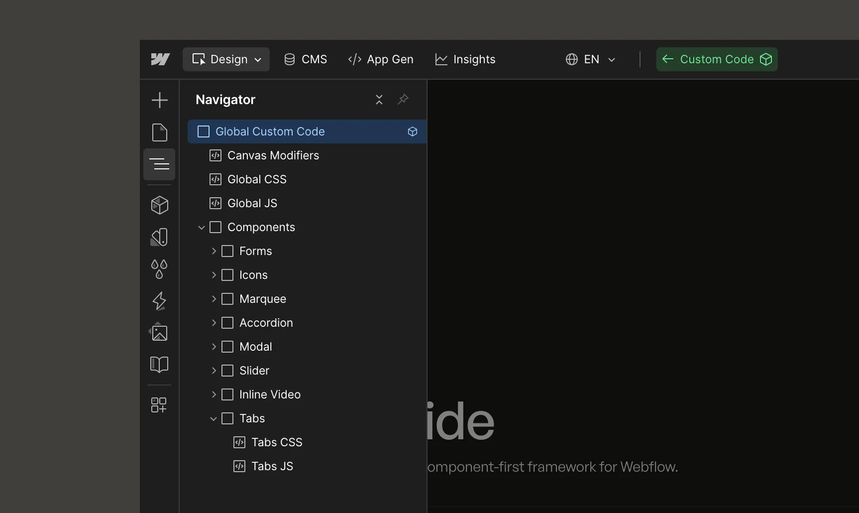
Custom Codecopy link
Global Canvas CSScopy link
There is a global component in the style guide project called Global Canvas CSS that should be add to the top of the navigator on every page of your project.
This component contains custom CSS that is used to reset, polish, and adjust certain things across the entire project, and which should also be visibly altered within the Designer canvas.
Hostingcopy link
We recommended you be strategic on where you place and host any custom code across a Webflow project to balance both performance and maintainability.
Embed
Code in an embed should only be used if on canvas development precision is a priority. For example, if the code must be placed in a specific location of the HTML, or if you have CSS that needs to render live in the canvas while developing other components/layouts natively. If it is CSS, just be sure the embed element is at the top of the navigator to ensure styling takes effect before corresponding HTML is rendered in the live site.
Page Settings
Add custom code to page settings if that code is only used 1-5 pages across the site. For example, if you have a custom slider or other JavaScript enabled components which only occur on a few pages across the site, so there is no need to load the JavaScript code for them on every page of the site (from project settings).
Custom Components
CSS
For any custom CSS corresponding to custom components, this can be added to the Custom Code component, within the Component CSS embed. This way, you can see any of that CSS render live in the canvas, while still keeping it in a single, global location. This approach is also preferred over storing the CSS directly in the component to save on HTML length and prevent duplicate CSS if there are multiple instances of a specific component on the page.
Javascript
For any custom components similar to those like Accordion, Slider, etc. that come in Mast, we recommend hosting any custom JS for them in an external repo like Github, deployed via a CDN like jsDelivr, and linked from the project settings. The JS should also be written with an "early exit" so if the corresponding component isn't on the page it returns to not fully execute and aid in page performance. This general approach is preferred over storing the JS directly in the component to save on HTML length and additional complexity of ensuring duplicate JS on a page doesn't executre more times then necessary. If you prefer to move the existing custom code JS to a different repo, feel free to fork it here.
Best Practices link
Some things to keep in mind when implementing any type of custom code.
HTML
SVG’s in an embed
Remove fixed height/width: Sometimes the exported SVG code from design tools like Figma will come with fixed width="XX" and height="XX" values in the main <svg> element. In order to more easily control the sizing of the SVG directly in the Designer, you can remove those two attributes, while ensuring you leave the viewBox attribute which is what will retain the proper aspect ratio of the SVG. From there, you can give the embed element a custom class with a set width or height to easily control the size of the SVG.
Add a <title>: If you are using SVG code within an embed which is within a link block that doesn’t have additional text, be sure to add the <title>Example Name</title> element within the SVG to act as an alternative to alt text for people using screen readers. Learn more here.
Use currentColor: If you want to upload an SVG and control it’s color from within the Designer, you can replace all fill or stroke attribute values with currentColor.
CSS
Keep it DRY
DRY stands for ‘Don't Repeat Yourself'. Not only is this best practice, but it will help you create, edit and maintain CSS much more efficiently. Here is a simple DRY example if we wanted to force several different types of link elements to inherit the text color of their parent, which doesn’t natively happen in Webflow:
Javascript
Non-class Targeting
When possible, target attributes and ID’s instead of classes. This way you separate the purpose of styling from the purpose of adding functionality with JS in order to prevent accidentally breaking functionality based on changing a class name for the purpose of a better class nomenclature.
Load external scripts in the <body>
When loading external javascript libraries, you should almost always load them within the Before </body> custom code section in order to not delay page load speeds. One exception to this is if you are going to include an async or defer method within the script so that it can then be included in the <head>. Learn more about async and defer here.
Styles
An overview of how to use the specific pre-built styles that come in the base Mast style guide.
Typographycopy link
Documentation and examples for Mast typography, including global settings, headings, body text, lists, and more.
Spacingcopy link
Unlike other systems that remove all default margins from type elements and classes, Mast has strategic default bottom margins set across most of the type system. This approach follows our Already Styled mindset because we have found it to be more efficient to build and maintain type styling globally when these margins are pre-applied.
A key aspect of what makes this type approach powerful is using EM units for the bottom margin. This allows the bottom spacing to always match the proportions of the font size which will naturally get smaller on smaller devices, therefore, there is no need to add an individual margin utility for every single breakpoint.
Font sizecopy link
All font sizes are in fluid utilizing CSS clamp() and a basis of REM to ensure users default browser font size changes are properly reflected. If you aren’t familiar with working in REM or developing designs that only use PX you can refer the the calculation of 1rem = 16px, or use an online calculator to do this for you.
Heading element vs classcopy link
Mast uses consistent variables to style both the base heading element (i.e. All H1 Headings) and class (i.e. h1) to enable maximum control over both design and accessibility with any use of headings. For example, if you need to use an h3 heading element in order to follow a semantic HTML structure, but you want that heading to be visually the size of an h2, then you would first set it to be an h3 in the heading’s element settings, then you would apply the h2 class.
Type sizecopy link
Colorcopy link
Mast starts with a minimal color system that themes our styles and components. This enables comprehensive customization and extension for any project.
Less is morecopy link
Similar to the minimal approach to the Mast type system, colors are also intentionally minimal with the mindset of only including the colors you will actually use within the project, opposed to including every single color within a brand palette.
The default Mast style guide follows a color palette of our core No-Code Supply Co. brand, but you can easily customize the color palette to align with the brand of your project.
Color as a utilitycopy link
All color classes are setup and prefixed with u- to recognize them as utility classes that can operate like any other utility where they are added as needed on top of elements, typography and other utility classes for quick styling adjustments.
All colors are also setup as global swatches in Webflow, so they can adjusted globally across all use cases within both utility or custom classes.
Background colorcopy link
Text colorcopy link
Modescopy link
Utilitiescopy link
Mast has several different sets of modifier classes that are added to elements to quickly adjust a finite amount of styling for a specific purpose.
Margincopy link
Paddingcopy link
Alignmentcopy link
Clamping link
Overflowcopy link
Display + positioncopy link
Responsive modifiers
Sizecopy link
Aspect ratio link
Helperscopy link
These utilities have multiple properties assigned and exist to make adding common, brand agnostic UI patterns quick and easy.
Layoutcopy link
Page Structure link
Every page in your project should have consistent structure of global and common elements to optimize for reusability and accessibility.
Wrapping all elements in a single <div> with the page-wrapper class makes it more efficient to copy/paste all elements from one page to another.
Wrapping all main sections in a semantic <main> element with the page-main class improves page SEO and accessibility by differentiating the main content from the global <nav> and <footer>.
Ensure you include the global Custom Code component on every page.
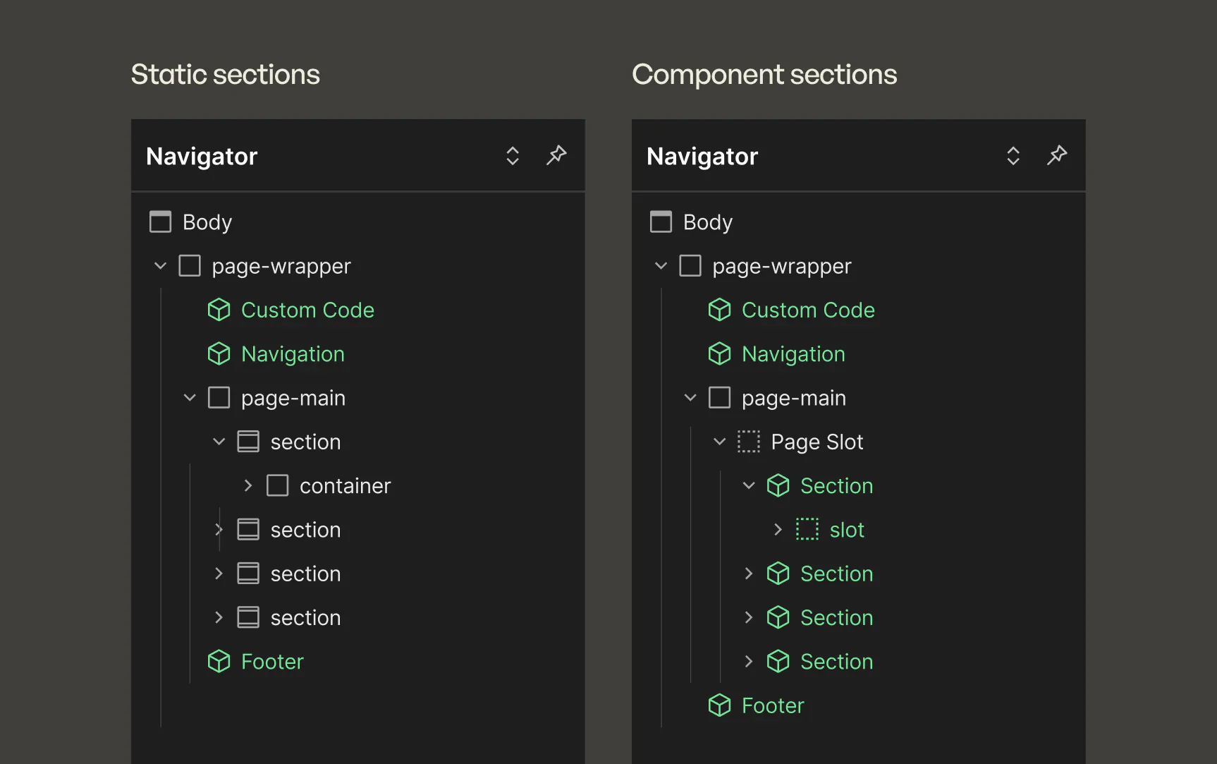
Page structure is relatively consistent when building with static elements versus components, with the exception that when building with mostly components, we recommend wrapping all in the main in a page slot so collaborators using Build Mode in Webflow can re-arrange sections as needed.
Sectioncopy link
This is a base class used on a <section> or <div> that wraps each section of content on a page to create consistent top/bottom padding across the project. As a base class, it can have both custom combo classes created for special variants, as well as accommodate various utility classes that work well with it like the u-pt-0 or u-pb-0 to remove the top or bottom padding to more precisely control a page’s visual rhythm.
Containercopy link
This is a base class used on a <div> that wraps all content which isn’t full width to create a consistently centered and left/right spacing. As a base class, it can have both custom combo classes created for special variants like a cc-narrow, as well as accommodate various utility classes as needed, though they are less commonly applied to these.
Gridcopy link
A powerful, responsive 12 column system of rows, columns and modifier classes, built with Flexbox and a time tested methodology. The system is an iteration of an approach originally inspired by Bootstrap columns, as well as other instances of people in the community using this approach like in this great video from También.
Structure
The grid system is setup with any number of columns (col) nested within a row (row).
The row can be given additional modifier combo classes to adjust vertical alignment and horizontal justification of the columns within it.
Each col is given any variety of breakpoint specific combo classes (see Responsive columns below) that define how wide the column should be at each breakpoint. All columns start off at equal-widths by defining the class of "col" and auto-collapse at the mobile portrait breakpoint if no responsive classes are defined.
Since Webflow also makes almost every aspect of native components and collection lists styleable you can use the grid for them as well! For example, create a blog grid with a collection list by setting the row on the collection list element and the col on the collection item element.
Responsive columns
To define our responsive 12 column grid, all classes after the initial class of col. If responsive columns are placed within a single row and which the total result in greater then 12, they will automatically wrap onto a new line.
When setting the combo class to define how many columns out of 12 the selected column should span, the number cascades down the breakpoints, so you only need to add a combo class for any break point where the width should change.
As you add responsive combo classes to the selector field in Webflow, the type ahead search will only show suggestions for the first responsive combo you add. Each additional responsive combo class you add won’t display in the search suggestions, but when you add them (spelled correctly) they will still take effect as expected. This is experience is due to a limitation of the Webflow class search functionality.
Align columns
Add these modifier classes after the row class to align the columns within it vertically.
Justify columns
Add these modifier classes after the row class to justify the columns within it horizontally.
Offset columns
Add these modifier classes after the col class to offset a column be a certain number of columns at each breakpoint.
Reorder columns
Add these modifier classes after the col class to reorder the column to first or last at each breakpoint.
Gap modifiers
Add these modifier classes after the row class to adjust the gap used in that group of row and columns.
Other column modifiers
These are a few additional modifier classes that are helpful for additional use cases.
Components
Mast comes with a few of the most common components almost every website needs. These are a mix of both literal components in Webflow, as well as components as a static instance of shared classes and elements.
Interactive
Formcopy link
Mast comes with a set of custom styled common inputs managed through static classes. By default, the inputs use a nested label aesthetic, but if this is not preferred for your project's design system, you can simply update the style props for the input, input-label, and input-group to reset it back to a more traditional approach with the label sitting above the input.
Accordion link
The accordion component is built with the latest <details> and <summary> HTML elements to ensure its optimized for accessibility. Below are some key details to keep in mind when using the accordion:
- The accordion component shares the padding and border radius variables of the card component to create visual consistency and CSS reusability. However, you can always change this by creating separate variables, or replacing the card variables with static values.
- Static accordions should be setup within a native non-bullet, list element as in the default components page to optimize for accessibility.
- To associate each accordion with others in the same section, utilize the Group name field.
- You can adjust the size of the title text by using a different class in the "Title Class" prop.
- There is a bit of custom JS in the project settings which closes the accordions by default on the published page, as well as utilizes GSAP to animate the open/close and icon rotation.
Modal
The modal component in Mast utilizes the latest HTML <dialog> element alongside a little custom CSS and JS as an easy to manage, and natively accessible modal. Below are some key details to keep in mind when using the Mast modal:
- The modal class shares the padding and border radiusvariables of the card component to create visual consistency and CSS reusability. However, you can always change this by creating separate variables, or replacing the card variables with static values.
- The modal requires some light java script stored in the project settings to handle the open and close functionality. The javascript supports many instances of a modal on a page at a time, and the only requirement is that the <button> that opens the modal must be the immediate next sibling of the mobal.
- To update the contents of a modal, simple select it in the navigator, open the element settings, and add any value to the "open" attribute already set on the modal. Once done editing, remove the value to re-hide the modal by default.
Slider
The slider component in Mast is based on Swiper.js and comes with most essential configurations for simple sliders. Below are some key details to keep in mind when using the Mast modal:
- If you aren't familiar with the underlying Swiper.js slider library, check out their docs and demos to get a better idea of all that is possible, and how some of the basic options already integrated into the Mast Slider component work.
- The navigation next and previous buttons just use the existing Button component in Mast, making them easily customizable and consistent with the rest of your project.
- Two essential props for Slides Per Breakpoint and Slides Gap, may look a bit odd at first, but pack a lot of power in a simple prop. Huge shout out to Timothy Ricks' creative approach with the Lumos slider that inspired how they are implemented in Mast.
- The Slides Per Breakpoint allows you to set any number (whole or decimal) within each variable (ie --lg) listed to define how many slides should be visible (in the container) at each breakpoint.
- The Slides Gap prop also uses a CSS variable (--gap) to update the amount of gap between the slides. The default value is set using the Gap MD variable, but you can change it to a different variable or a more specific value like 1rem, 20px, etc.
- You can use a CMS collection within the main Slider component by following these 3 simple steps:
- Add a collection list to the canvas and add the Slider Slide component within the collection item.
- Fill the slide with any desired contents and when done create a new component out of the collection list.
- Drop that new CMS collection list component into the instance of the Slider component you want the integrate the collection list with.
Inline Video
The inline video component in Mast is an easy way to lazy load and provide basic playback controls to inline videos in your project. Below are some key details to keep in mind when using the Mast inline video:
- Within the Video prop group, ensure you set the proper type value corresponding to the file type of video you are playing (ie type/mp4 for a .mp4 video). To host the video, you can either add a native background video component to a hidden page, upload, and get the hosted link from that (though this method can harm the resolution of the video by Webflow's auto-compresison) — or you can upload the video to one of many video hosting services like Vimeo, BunnyCDN, Flowdrive, etc.
- The poster image is a native Webflow image element so you can bind it to the CMS if desired, or control other things like the lazy loading (not able to be bound to a prop yet though).
See the custom settings to control when/how the video plays:
- Play on desktop only: When set to "true" the video will only be loaded on viewports above 991px, and only any size below it will only show the poster image without loading the video. This is useful when your video is larger in file size so you don't want to load it on mobile at all to prevent slow page performance.
- Play on scroll into view: When set to "true" the video will not be loaded until its almost within the viewport to ensure videos further down the page don't impact initial page load performance.
- Play on hover: When set to "true" the video will play when the user hovers over the top of the video.
Marquee
The marquee component in Mast is a pure CSS based animation component to slowly loop through any duplicate set of components. Below are some key details to keep in mind when using the Mast inline video:
- Be sure to add the exact same set of components in each marquee-group slot within the component so the loop effect works as expected.
- Use the Advanced > Style prop to set a specific width on the components in the groups that are being looped if the width isn't already defined on the component you are looping.
Tabs
The tabs component in Mast is a fully custom, flexible, and accessible approach to creating tabbed experiences. Below are some key details to keep in mind when using the Mast inline video:
The tabs components is made up of a variety of separate components that are intentionally paired together to create as flexible of a layout as possible. You will notice in the base Mast cloneable, there are several examples of how these components should be arranged together, and can be intermixed with other Mast components like the layout components, icons, headings, text, etc. for maximum flexibility.
- The main Tabs component should be a parent of Tabs Menu and Tabs Content.
- The Tabs Menu should be the parent of the Tabs Link components.
- The Tabs Play/Pause component must be a child of the Tabs component.
- The Tabs Pane components must be a child of Tabs and the order they are present in the DOM corresponds to the order of the Tabs Link components in the Tabs Menu.
The Tabs Menu component holds all of the core settings for the tabs outlined below:
- Alignment: Toggle the variant between horizontal (default) and vertically stacked Tabs Link components in the slot within it.
- Mobile Menu Dropdown: Change the value to "true" and the tab menu will collapse into a dropdown on mobile landscape and portrait.
- Autoplay: Set as "true" to have the tabs start automatically playing through when scrolled into view.
- Autoplay Duration: If autoplay is true, set a number value in this prop to define the amount of seconds it takes between tab changes.
- Autoplay Pause on Hover: If autoplay is true, change this prop to "true" so when the user hovers over the Tabs component the autoplay will pause.
- Be sure to set a value in the Tab Label prop of each Tabs Link component as that is what is read out to screen readers to define the tab after it's contents, and also used as the label of the mobile dropdown menu if that prop is set to true.
- If you want to alter which specific tab is active by default, simple set the class of cc-active in the Advanced > Class prop of the preferred Tabs Link component.
- You can set a unique value in the ID prop of any Tabs / Link component, and then if you want to link to the page with that tab active, simple add the unique ID to the url like example.com/test#tabidhere.
tabs-componenttabs-menuContent
Eyebrow
A component based version of eyebrow text with a smidge extra styling, and the ability to be used within a Build mode page.
Icon link
Icons in Mast utilize a nested component and variant strategy, alongside an external CSS based icon library to make it easy to globally manage icons across your project. Icon size and color controlled with component variants, and the specific icon to show is set from the class nomenclature of the CSS icon library you use.
By default, Mast has the Phosphor icon library installed, below are the steps to take to update it to a different library.
- Open the embed within the Custom Code component in Webflow.
- Replace the href attribute of the Phosphor CSS <link> at the top of the embed with the URL of the new CSS based icon library you want to use instead.
Image
The image component is useful both within component slots for Build Mode and statically as a simple, consistent way to control image aspect ratio and fit.
Cardcopy link
The card is intentionally simple, yet modular in the way it separates the card wrapper and padded body classes so you can mix and match them to create a variety of types. The card component in Mast also uses variables to control the border radius and padding, which are also used on the accordion and modal components.
Table link
The table component is a simple baseline <table> and corresponding child HTML elements built out with components and slots.
Heading link
The heading component exists mainly for use within component slots so you can independently control the tag and size of the heading.
Rich Text link
This is the main content component used to add text in most cases across a page. You can also use this versatile component to add other inline elements like a YouTube or Vimeo embed, code blocks, maps, and more — see the full list of whats possible in Webflow's documentation.
The component uses the rich-text base class with native element child selectors for any fine tune styling adjustments beyond the base body and element styling already defined in the cloneable project. Go to the Styles page in the cloneable to find an example rich text element with the rich-text class applied so you can select the child elements to easily make any necessary styling adjustments.
Plain Text link
A simple plain text component that is mainly used when you want to bind some plain text in CMS collection to a component, otherwise we recommend using the Rich Text component for most other text content on a page when possible.
Content Wrap
Optimize your groups of elements like accordions, CTAs, cards, etc. with this content wrapper to do a variety of adjustments as follows:
- Adjust the alignment variant to control child alignment.
- Add a specific role attribute like role="list" when using it to wrap a list of elements like Accordion components.
- Define an ID around the group of element for anchor linking or custom functionality.
- Set an animation on the component or its children.
Global
Theme toggle
The theme toggle component in Mast uses both CSS and JS to enable both automatic and user toggled color mode selection on your website. Below are some key details to keep in mind when using the Mast inline video:
- The general theming between light and dark mode is handled with the newer light-dark() spec in CSS that allows you to declare a color for both the light and dark modes of the user's OS in a single property, which we can thankfully add natively in the Theme variables collection. The other key aspects that make it work are declaring the color-scheme on both the root (set in Theme Toggle CSS embed in Custom Code) and on the u-mode-dark and u-mode-light classes which are used by the Theme Toggle JS to append to the HTML if the user chooses to alter the color mode manually via the toggle component.
- Ensure the "Theme Toggle" group of CSS and JS embeds within the Custom Code component in your project are there and set to visible for this functionality to work.
- To disable the theme toggle functionality, open the Custom Code component, within the Components div, select the Theme Toggle div wrapping the CSS and JS embeds and either remove it entirely or set it's visibility to hidden. Then, update any variables in the Theme collection to no longer use the light-dark() function, but instead just be directly bound to any other variable color.
Custom Code
An embed component intended to store all custom code, primarily CSS and JS. Below are some key details to keep in mind when using the Nav component:
- The Canvas Modifiers embed contains only CSS that is modifying certain details of UI on the canvas only when not in preview mode or on the live page.
- The Global CSS and Global JS embeds are as their name implies generic custom code that isn't specific to a certain component, but likely used on the majority of pages.
- If you want even more control over peak performance on each page, you can add visibility props to each component custom code wrapper, so on any given page if its not using certain component you can set it to hidden which won't render any of the custom code in the HTML at all since Webflow visibility props are server side.
- You will notice that any custom JS for certain Mast components is hosted on a CDN — you can optionally clone the Github repo where each of those files modify and/or host them on your own.
- There is a Per Page CSS Overrides div wrapper in the component that has visibility set to hidden (so it doesn't render on live pages), but is a work around for a known bug where Webflow doesn't properly detect all classes set in component class props on a page. Adding any div's and specific essential utility classes to this element will ensure they are still bundled into Webflow's native Per Page CSS functionality that is valuable for optimal page performance of large sites.
Build Mode
The Mast build mode components enable site collaborators to take advantage of Webflow page building to create simple, flexible landing pages quickly. They combine component props, slots, and variants with a familiar Mast structure to create a variety of columned layouts, while allowing for a wide range of content in any column with rich text. Below are some key details to keep in mind when using build mode components:
- There is a static page template in the cloneable where you can see a variety of simple layouts all built with these components.
- Beyond the 3 types of build mode components below, you can also use other core site components like the Button or Icon.
Section
The main parent componet for structuring each section of a page built with Build mode components.
Grid
Using the same foundational approach as the class based Mast Grid, we combine row and column components to create a simple, modular approach to build a wide variety of layouts.
Spacer
Occasionally, you may want to adjust spacing between elements beyond the defaults when creating layouts for Build mode, so this spacer component makes that easier.
Border
A componentized version of the standard u-border class for use in Build mode.
Change Log
Notes on what changed with each version of Mast.
Version 2.4copy link
November 2025
Styles/Variables
- Attribute based global animation system.
- Updated Theme variables collection updates to support Theme Toggle.
- Added new column offset classes for additional layout flexibility and precision.
- Added new column contain left/right classes for use when creating a row where one side extends to the viewport edge (beyond container), but the other side is still contained.
- Added a new Columns variable to define the total number of columns the grid system is based on (defaults to 12).
Components
- Added a new Table component.
- Added a new Theme Toggle component.
- Added a new Tabs component.
- Added a new Slider component.
- Added a new Inline Video component.
- Added a new Marquee component.
Refinements
- Refine component prop organization and nomenclature for better consistency across all components.
- Button updates for optimized accessibility, re-use within other components, and default hover style.
- Added an example Rich Text element with the rich-text base class to the Styles page for easier access and initial styling of nested rich text elements.
- Refactor of container and row/col gap are setup to now support a new container gutter variable.
- Moved externally hosted component JS files from project settings into the Custom Code component as a more organized, single source of truth for all custom code in the project.
- Added a Canvas QA visibility prop to the Custom Code component that can be toggled on to show special CSS that will highlight issues to resolve (ie outline empty links or label components missing custom code) or make review hidden content easier (ie overflow scroll on slider).
- Added visibility props on each component group within the Custom Code component so you can toggle off custom code for any components you aren't using on the current page to maximize page performance. These are also supported by the new Canvas QA prop so if you add a component to a page when the custom code for it is still turned off it will display a lime green alert tag on top indicating the custom code needs to be enabled.
Version 2.3copy link
August 2025
Styles
- Responsive variable collection removed and replaced by fluid clamp values throughout.
- All typography groups now have fluid font size and corresponding min and max variables.
- Section padding is now set with a fluid clamp.
- Added column offset utilities to the grid system.
Components
- Updates to the Image component to support a custom aspect ratio instead of inheriting size to encourage avoiding CLS issues.
- The Section and Grid - Column components no longer have default gap, and contents now dynamically use existing default margins for consistency with static development with corresponding classes.
- The Border component now has default spacing variants that match the Spacer component sizes.
- The previous modal classes and elements are now a proper Modal component with props and a slot to add components within the modal.
- Added visibility props to all components within Advanced prop group.
Refinements
- Global Custom Code component organization improvements.
- Optimized the custom javascript for the Modal and Accordion components so they can be served from the project settings while ensuring they only execute if a corresponding component is present on the page, as well as moved the code for each to a CDN for cleanliness and any future global updates.
- Changed the btn class nomenclature to the full word of button for consistency with lack of abbreviation on all other base classes.
Version 2.2copy link
July 2025
Components
- All IX2 interactions removed in preparation for adopting the new Interactions with GSAP (IX3)!
- The Nav component's mobile menu button animated converted to pure CSS.
- The Accordion has been refactored to now be built with a <details> and <summary> elements for improved accessibility, plus utilizes some JS and GSAP to animate it.
- Added a Spacer component.
- Added a Border component.
Refinements
- Most components now have a style prop by default that can be used for easy inline styling of things like a specific max width to control precise word wrapping.
- The Image component now has a Background variant.
Version 2.1copy link
April 2025
Components
- Added a new Heading component to make controlling the semantic and visual size independently easier.
- Added a new Image component to support easier management of size, aspect ratio, and object fit position.
- Added a new Card component for use in Build Mode by default.
- The Content component was renamed to Rich Text to clarify its purpose and capabilities, as well as to differentiate it more from the new Heading component.
Refinements
- Fixed rich-text to support adding paragraph utility classes to alter all base font sizes.
- Icon component updates to better support of other CSS icon libraries.
- Added a Custom Class property to all components for easier edge case mods.
- Global Custom Code component now has a div wrapper so additional embeds can be added if desired and its also named just Custom Code.
- Removed the Size variable collection due to minimal usage and purpose.
Version 2.0copy link
January 2025
Typography
- Changed paragraph utility classes to use t-shirt size nomenclature
- Changed spacing utility classes to use t-shirt size nomenclature
- Added H5 and H6 in base cloneable
Utilities
- Added new text utility classes
- text-wrap: balance & pretty
- text clamp - lines 1, 2, and 3
- Updates to Grid Gap
- Renamed Row & Col Gap variable to Gap Main
- Added Gap MD and Gap SM variables and corresponding classes. These enable you to use row/cols for smaller scale flexbox based UI instead of needing a lot of separate u-d-flex utility classes.
- Removed padding top and bottom utility classes other than 0, due to lack of usage and confusion between use of those versus margin utility classes.
Components
- Moved components to a standalone page
- New components!
- Button (now a component)
- Nav
- Footer
- Accordion
- Modal
- Eyebrow
- Icon
- Build mode components
- 4 components to rule them all — Section, Row, Column, and Content
- Mix and match these to create a wide variety of common layouts, and mix in eyebrow, button, icon, and accordions
- Content component is just a rich text element
Variables
- Replaced all font-weight and line-height variables with native unitless values
- Variable collections for Theme, Responsive, Typography, Components, Layout, Color, and Size
- Variable color modes include Base, Invert, Accent 1, and Accent 2
- Added 4 new utility classes for each of the color modes to quickly add/remove them from any section or component
Page templates
- Design Mode Template is a basic starter page structure for Webflow developers
- Build Mode Template is a for non-Developer collaborators to use to create simple, flexible landing pages with the Build Mode components. It comes with small variety of example sections that can be created with it.
Version 1.4copy link
February 2024
Buttons
- The btn class default styling was adjusted to be display: inline-flex and gap: 0.4em to support native button icons.
- Default buttons now include more variants that include icons.
Utilities
- Added a new u-d-inline-flex utility class.
- Added a new u-position-sticky utility class.
Version 1.3copy link
February 2024
Updated how custom CSS is used throughout Mast to move as many properties as possible into the new Custom Properties feature in Webflow.
Version 1.2copy link
February 2024
Added and integrated a full range of native Variables across all critical elements and styling.
Share some feedback
Have a question or comment related to MAST? We are grateful for anyone that has the time to take it for a spin and welcome all feedback!
Send Feedback